Watercolour for beginners
The first watercolour I painted was a sunset, and I ruined it in the most predictable way: when I wanted a bright cloud, I reached for white paint and dabbed it on top. It sat there, chalky and dead, on a sky that had been glowing a moment before. Watercolour doesn't work like the other paints — and once I understood why, everything got easier.
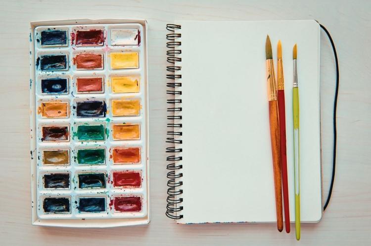
Here's the good news, and it's the whole secret: in watercolour, your white isn't a paint, it's the paper. The light you love in a watercolour comes from the paper shining up through transparent colour, so the trick is to leave the white alone and work from light to dark. Master that one idea, put it on the right paper, and you'll be laying luminous washes far sooner than you'd think. This guide takes you from a blank sheet to a finished first landscape, and explains why each step works.
What watercolour actually is
Watercolour is finely ground pigment bound in gum arabic and thinned with water. What makes it special is that it's transparent: light passes through the colour, bounces off the white paper, and comes back to your eye, which is what gives watercolour its inner glow.[1] That single fact drives everything. Because the paint is see-through, you can't cover a dark with a light — so you reserve your highlights (leave them as bare paper) and build up from pale to deep.[1] It's the opposite instinct to painting with an opaque medium, and it's the thing beginners most often get told too late.
Watercolour is also very old, but its best-loved chapter is the English landscape tradition of the 1800s — Girtin, Cotman and above all J. M. W. Turner, whose luminous skies used the soft, blooming edges of wet paint.[7] Part of the reason watercolour is such a beloved British hobby is that we half-invented the modern version of it.
Paint: hues, grade and a starter palette
Two things on a tube are worth understanding before you buy. First, "Hue." When a colour says "Cadmium Red Hue" or "Viridian Hue," it's made from a substitute pigment that imitates a colour whose real pigment is expensive, toxic, or fades.[2] Hue paints are common in student sets, usually cheaper, and — a genuine bonus — often safer, because they avoid heavy metals like cadmium.[2] They can mix a little less cleanly than the genuine article, but for learning they're perfectly good.
Second, lightfastness — how well a colour resists fading. Check the tube for an ASTM rating and favour I (excellent) or II (very good) for anything you want to keep.[3] One to know about: Alizarin Crimson, a lovely but famously fugitivecolour that fades over time; many painters swap it for a "Permanent Alizarin" or a quinacridone red.[3] As an experienced tutor might put it, cheap paint that fades isn't cheap — it's a painting with an expiry date.
You don't need the leaflet's twelve colours to start. A limited palette teaches mixing far faster: a warm and a cool of each primary — say a warm and cool red, a warm and cool yellow, a warm and cool blue — from which you can mix clean greens, oranges, purples and a huge range of greys. Fewer tubes, cleaner colours, less mud. As for format: pans (dry cakes) are neat and portable and ideal for small work; tubes (moist paint) are better when you want to mix the larger, stronger quantities a big wash needs. A pan set is the cheapest easy way in.
Brushes
You need very few. The workhorse is a large round (around a size 8–12) that comes to a good point — it holds plenty of water for washes and tapers to a tip for detail, which is why the leaflet itself admits many painters simply use one large brush, one small brush and a wash. Add a wash or mop brush for big skies and a fine rigger for thin lines (grasses, branches, masts). Synthetic brushes are inexpensive and fine for beginners; natural sable holds more water and points beautifully but costs a lot more — a want, not a need.
Paper: the part beginners get wrong
If your first watercolours buckled into hills and valleys with paint pooling in the dips, your paper was the culprit — not your technique. This is the leaflet's biggest gap, so here's the rule.
Watercolour paper is sold by weight, and 300gsm (140lb) is the beginner sweet spot: it takes normal washes without cockling. Anything lighter (like 190gsm/90lb) buckles badly once wet, while 640gsm (300lb) never needs stretching at all.[4] Just as important is the fibre: 100% cotton paper is dramatically more forgiving on wet work than cheaper wood-pulp (cellulose) paper — so much so that a 300gsm cotton sheet outperforms a heavier cellulose one.[4] Cellulose pads (Canson XL, Cotman) are great, cheap practice paper; save a few cotton sheets for a painting you care about.
If your paper is on the lighter side, tape the edges down with low-tack tape (brown gummed tape holds even better), or stretch it first (soak it, tape it to a board, let it dry drum-tight); glued blocks, bound on all four sides, skip the fuss entirely.[4] Finally, surface: Hot Pressed is smooth (good for fine detail), Rough is heavily textured, and Cold Pressed(sometimes "NOT") sits in between — the sensible all-round choice to start.[4]
The one principle: reserve your whites, work light to dark
Here it is, plainly. Because watercolour is transparent, the white in your painting is unpainted paper, saved from the very start. You plan where your brightest lights will be — the sunlit edge of a cloud, a glint on water — and you simply don't paint there, letting the paper stay white while colour goes around it.[1] Then you build the picture from your palest washes to your darkest darks, because you can always go darker but you can't easily go back to light.
This is why a watercolour box often has no white paint, and why the leaflet's Chinese White deserves a caveat: opaque white is useful for a few tiny highlights added at the end (a star, a whisker), but painted over large areas it goes chalky and kills the glow.[1] Reserve the paper instead.
If leaving crisp white shapes by hand feels daunting, masking fluid (a peelable latex) lets you paint freely over areas you want to keep white, then rub it off at the end. It's handy for small, sharp highlights — though plenty of painters skip it and simply paint around their whites, which is a skill worth building.[5] Apply it to dry paper, let it dry, and only remove it once everything else is bone dry.[5]
The core techniques
Almost everything in watercolour is a variation on the wash. The ones to learn first:
- Flat wash: even colour over an area. Mix plenty, load a big brush, work in overlapping horizontal strokes from the top, and guide the "bead" of paint down the page; keep it moving so no edge dries mid-wash.[6]
- Graded wash: the leaflet's own trick — start dark at the top and add water to each stroke so the colour fades to nothing. Perfect for skies.[6]
- Wet-on-wet: paint into paper you've pre-wetted, and the colour blooms and spreads into soft, atmospheric edges. Beautiful and a little wild — Turner's territory.[6]
- Wet-on-dry: paint onto dry paper for crisp, controlled edges. This is the basis of glazing — laying a transparent wash over an earlier one that is completely dry to deepen or shift its colour.[6]
Two more to know: lifting (blot a damp wash with a tissue or thirsty brush to pull colour back out — this is how you make soft clouds), and granulation (some pigments, like French Ultramarine, settle into the paper's texture for a lovely grainy effect).
Seeing like a painter: composition and distance
The leaflet is genuinely good here, so let's keep it. Place your horizon about a third up the page, not halfway — our eye takes in far more sky than ground, and a low horizon usually looks more natural.
And use aerial (atmospheric) perspective to create depth: as things recede into the distance they get smaller, less detailed, less vivid and cooler in colour, and paler with less contrast. Paint your distant hills in muted, cool, watery colour and your foreground in your strongest, least-diluted paint, and the picture will fall into depth almost by itself.
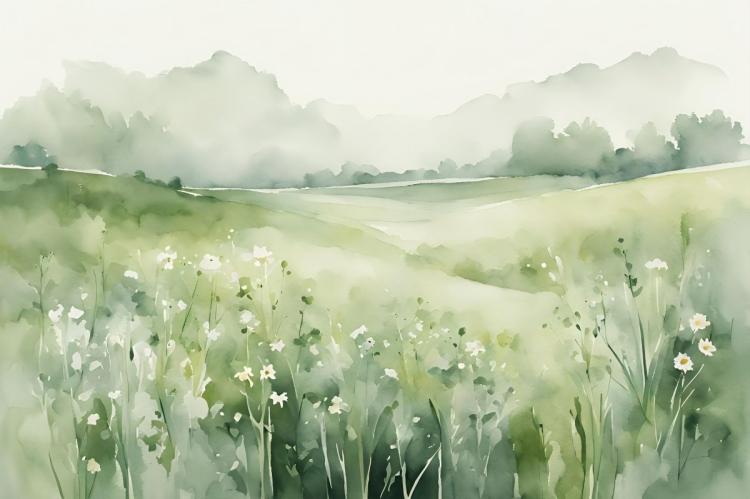
Your first painting: a simple three-distance landscape
Let's put it together in a landscape built from three bands of distance, using only what you've just learned.
- Set up. Tape a sheet of 300gsm cold-pressed paper to a board. Lightly pencil a horizon about a third up, and mark where your brightest sky and any water highlights will be — the whites you'll reserve.
- Sky first, top down. Wet the sky area and lay a graded wash of a cool blue, palest near the horizon. While it's still damp, lift out a few clouds with a scrunched tissue. Let it dry completely.
- Distance. With muted, watery, cool colour (a little blue-grey-green), paint the far hills wet-on-dry so they stay soft and pale. Let dry.
- Middle ground. Slightly stronger, slightly warmer greens for the mid-distance. Let dry — this drying between bands is what prevents backruns.
- Foreground. Your strongest, least-diluted colour here, with a few crisp dark accents and some dry-brush or rigger marks for grasses. Keep your reserved whites white.
- Stop. Resist fiddling. Watercolour rewards knowing when to walk away.
That's a complete landscape, built from a graded wash, lifting, light-to-dark layering and reserved whites — no special talent, just the sequence.
When it blooms or muddies: quick fixes
- Cauliflower blotches (backruns): you touched a wash that was drying but not dry. Let each layer dry completelybefore adding the next, and mop excess water from the bottom of a wash. (Or lean in — the same effect makes great foliage and clouds.)[7]
- Paper buckling and pooling: paper too light or unsecured. Use 300gsm+, tape it down, or stretch it.[4]
- Muddy colours: too many pigments mixed, or layering before the last wash dried. Mix from two or three colours, and let layers dry.
- Everything looks flat: you overworked it, or diluted the foreground too much. Keep darks dark and let some whites stay.
- Lost your highlights: reserve them next time (or lift while wet); resist "fixing" with white paint.
Clean-up, storage and a word on safety
Watercolour cleans up beautifully — warm water and, if needed, a little soap for the brushes; reshape the point and store brushes upright or flat, never resting on the bristles. Pans and tubes keep for years; just close tubes tightly.
On safety, a fair and proportionate word. Watercolour is one of the safest media — no solvents — but any toxicity comes from the pigment, and a few genuine colours (some cadmiums and cobalts) are best treated with care, mainly because you don't want to ingest them.[8] The precautions are easy and worth making habits: don't eat or drink while you paint, don't point your brush with your lips, wash your hands afterwards, keep your palette and water jars separate from kitchen things and away from children and pets, and don't pour large amounts of genuine cadmium/cobalt rinse water down the drain.[8] The AP/CL seals on the tube tell you what you've got — and, helpfully, the "hue" colours in a typical starter set sidestep the heavy metals in the first place.[2]
Lay one wash today
Don't wait to feel ready. Tape down a scrap of proper watercolour paper, mix a puddle of one colour, and lay a single graded wash — dark at the top, fading to nothing. Watch the paper glow through it. That one wash is the whole medium in miniature; everything else is reserving your whites and repeating it.
This guide is for general educational purposes and reflects manufacturer, museum and experienced-educator sources; it isn't professional health, safety or conservation advice. Follow the specific instructions on your paints, and your local rules for disposing of any hazardous-pigment rinse water. The expert observations here are illustrative — the kind of thing an experienced tutor would say — not quotations from a named individual.
FAQ
Do I need white paint? No — in watercolour the white is the paper, reserved as you go. Keep opaque white only for a few tiny highlights at the very end.[1]
Which paper should I buy first? A 300gsm (140lb) cold-pressed pad. Cotton is best for wet work; cellulose (Canson XL, Cotman) is a fine, cheaper practice option.[4]
Why did my paper buckle? It was too light or not secured. Use 300gsm or heavier, and tape or stretch it before you start.[4]
Are watercolours safe to use with children? Generally yes, especially AP-sealed and hue colours; just keep paint and painting water out of mouths, separate from food, and wash hands after.[8]