Calligraphy for beginners: how to make your first beautiful letters
My handwriting is genuinely bad — the kind that makes pharmacists squint and birthday cards look faintly threatening. So when I first picked up a calligraphy pen, I assumed I'd disqualified myself at the door. I was wrong, and pleasingly so.
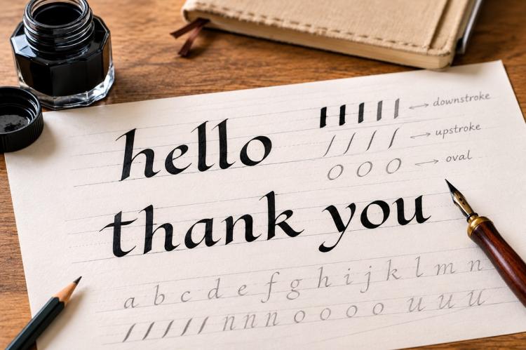
Here's the good news, and it's the truest thing the old leaflets get right: calligraphy rewards patience far more than "talent." You are not writing faster or more naturally; you are drawing letters slowly, to a system, with a tool that does much of the beautiful work for you. Once you understand the one idea the tool is built around — and it's an idea most beginners never get told — your letters start looking like calligraphy almost immediately. This guide will take you from a blank page to a first written word, left-handers very much included.
What calligraphy actually is (and which kind this is)
Calligraphy simply means "beautiful writing," and it's far older than printing: medieval scribes wrote entire books by hand using broad-cut quills and reeds. What we'll learn here is broad-edge calligraphy, the tradition those scribes belonged to, brought back into modern hands largely by the English craftsman Edward Johnston in the early twentieth century.
It's worth knowing which family you're in, because there are two. Broad-edge calligraphy uses a flat, chisel-shaped nib and makes its thick and thin strokes from the angle you hold the pen — no pressure required. Pointed-pen styles (Copperplate, Spencerian, and most of what's called "modern calligraphy") use a flexible pointed nib and make thick strokes by pressing to spread the tines. They're genuinely different skills. This article is broad-edge, which is the more forgiving and logical place to begin. If you already love the flowing, pressure-based look, that's a pointed-pen path — a different guide.
Your first kit
You need very little. There are two easy routes:
- A dip pen and broad-edge nibs. Cheap and traditional: a pen holder plus a few broad-edge (round-hand) nibs in different widths — a broader one for large letters, a finer one for small. On the common numbering, confusingly, the bigger the number the finer the nib.
- A Pilot Parallel Pen. A broad-edge fountain pen with cartridges — no dipping, no coating to remove, steady flow. Many teachers call it the single best beginner tool, and it sidesteps the two things that trip people up.
Add smooth, well-sized paper (rough or very absorbent paper makes the ink feather into fuzzy edges), a pencil and ruler for guidelines, and ink (more on choosing it below). A cheap broad-edge felt marker is a fine way to feel the angle before spending anything at all.
Prepare your nib (the step everyone skips)
If you're using dip nibs, do this first or nothing else will work. New nibs come with a thin anti-rust coating that repels ink, so a fresh nib often won't hold a drop — and beginners understandably assume it's faulty. Remove the coating with a little soap and water, a rub of saliva, a dab of toothpaste, or the old trick of pushing the nib into a raw potato for a few minutes. Rinse, dry, and you'll see ink cling evenly to the metal. (Parallel Pens skip this entirely.)
The one idea: a constant pen angle
This is the concept the whole craft turns on, and the leaflet never mentions it. A broad-edge nib lays down a line whose thickness depends on the angle between the direction you're moving and the flat edge of the nib. Drag it along its own edge and you get a hairline; move at right angles to the edge and you get its full width; everything else falls in between. That's why the same nib gives you thick downstrokes and thin cross-strokes automatically — you never press.
The trick, then, is to fix the pen at one constant angle to the writing line and keep it there, stroke after stroke. For our beginner hand that angle is 30°. Hold it steadily and the thick-thin pattern comes out right on every letter; let your hand quietly rotate and a stroke that should be thin comes out thick, which is the real reason so much first-attempt calligraphy looks "off." As one experienced tutor puts it, calligraphy is less about a clever hand than a disciplined one — the letters look after themselves if the angle does.
Two quick clarifications. First, pull the pen, don't push it — pushing catches the edge and splatters. Second, the leaflet's "30° angled surface" is the slope of your desk board, which is about comfort and sightline; it's a different thing from the pen angle, even though both happen to be 30°. Don't confuse the two.
Guidelines and nib widths
Calligraphy is written between ruled lines, drawn in pencil so you can rub them out once the ink dries. You need four:
- the baseline, where letters sit;
- the x-height line (the "waistline"), the top of small letters like a, o and x;
- the ascender line, reached by the tops of b, d, h, k, l;
- the descender line, reached by the tails of g, j, p, q, y.
Here's the correction that matters: ascenders and descenders are parts of letters — those upper and lower extensions — not "upstrokes and downstrokes." Upstroke and downstroke describe the direction the pen travels; they're a different idea entirely, and muddling them will tie your guidelines in knots.
How tall should the lines be? In broad-edge work you measure height in nib widths, not millimetres, so the letters stay in proportion whatever nib you use. Make a little ladder: touch the nib to the paper and step it along in small square blocks, corner to corner, to count off the height. For our beginner hand the small-letter height is about four nib widths, with ascenders and descenders extending roughly two to three nib widths beyond. Rule your lines to that ladder and every letter will sit in proportion.
Your first hand: Foundational
Don't agonise over which "style" to pick — start with Foundational Hand. Johnston built it as a teaching script from the round letters of a thousand-year-old manuscript, and it's clear, upright and logical, which is exactly what a beginner needs.
Its secret is the letter o: a full, rounded circle that sets the shape for almost every other letter (c, e, d, b, p and q are all built on that same curve). Write it with the pen angle held at 30° — turned a touch steeper, to about 45°, only for diagonal strokes like those in v, w, x and z, to keep their weight balanced. Keep the small letters at your four-nib-width height, follow a good alphabet chart for the stroke order (the "ductus"), and resist the urge to join letters up — calligraphy is built from separate, deliberate strokes, not cursive flow.
Ink and keeping your nib happy
Ink choice quietly decides how much trouble you're in. Waterproof, acrylic and India inks give permanent, vivid colour, but they dry hard and will clog — even ruin — a nib if left on it; India ink is especially stubborn to clean out. They're fine once you're in the habit of cleaning promptly. Gentler starters are non-waterproof calligraphy ink or a little gouache loosened with water, both of which rinse away easily.
Whatever you use, keep a jar of water beside you and dip the nib in it every few lines to stop ink drying and choking the flow. When you finish, clean the nib and — this is the bit people forget — dry it thoroughly, because a nib left wet will rust. Don't squeeze or pick a nib up by its writing tip; the fine edges bend easily.
For left-handers
Left-handers can absolutely do broad-edge calligraphy; it just needs a small rethink. Because your hand naturally sits at the mirror of a right-hander's, a nib held the usual way tends to produce a reversed thick-thin pattern, and pushing it can make it catch. Three fixes, used together or singly: rotate the paper (often clockwise, up to about 45°) so your strokes pull rather than push; settle into an under-writing or over-writing hand position that keeps the nib pulling; and consider a square-cut or left-oblique broad nib, which is ground to suit the left-handed angle. Starting on a broad-edge marker or Parallel Pen removes the snagging while you find your position. Plenty of fine calligraphers are left-handed — it's a set-up problem, not a talent one.
Your first piece: from double-pencil to a written word
Here's a first session that teaches the whole idea and ends with something to keep.
- Fancy skating. Tape two pencils together with their points level — now you have a "double nib" that draws both edges of every stroke. Holding it at 30°, write a few big loops and an 'o'. You'll see the thick and thin appear from the angle alone. Johnston called this fancy skating, and it's the fastest way to feel how the pen works.
- Rule up. With a real nib, make a nib-width ladder, then pencil a baseline and an x-height line about four nib widths up (add ascender and descender lines if your word needs them).
- Warm up the letters. Fill a line with 'o's, then the o-family: c, e, d. Keep that 30° angle fixed.
- Write a word. Choose something short — a name, "hello," "thanks." Build each letter from separate strokes, pulling the pen, angle steady.
- Finish. Let the ink dry completely, then rub out the pencil guidelines.
That's a real, finished piece of calligraphy, made from one warm-up and one alphabet family. Keep it — the wobbles are the point of a first attempt.
When it goes wrong: quick fixes
- Ink won't flow from a new nib: you didn't remove the coating. Clean it (soap, saliva, or potato) and try again.
- Blobs and blots: too much ink on the nib, or ink drying on it — dip in water, wipe, and load less.
- Thick where it should be thin (or vice versa): your pen angle has drifted. Reset to 30° and keep it locked.
- Scratchy, catching strokes: you're pushing the pen or pressing too hard — pull, and let the nib's weight do the work.
- Wobbly, uneven letters: slow down and rule proper guidelines; speed comes much later.
Care, storage and a word on safety
Clean and dry your nibs after every session and store them dry so they don't rust; a nib kept clean lasts for years. Calligraphy is low-hazard, but treat inks sensibly: keep them off skin and out of eyes, ventilate the room if you ever use a solvent-based cleaner on stubborn waterproof ink, and don't tip large quantities of pigmented or shellac-based ink down the sink — wipe residue into the bin and rinse small amounts with plenty of water. Keep inks and small nibs away from children.
Write one letter today
You don't need to buy anything to start. Tape two pencils together right now, hold them at a slant, and draw a single fat-and-thin 'o'. That one letter contains the whole craft — the rest is ruling a few lines and repeating it onto nicer paper.
This guide is for general educational purposes and reflects manufacturer, museum and experienced-educator sources; it isn't professional conservation or safety advice. Follow the specific instructions on your inks and pens. The expert observations here are illustrative — the kind of thing an experienced tutor would say — not quotations from a named individual.
FAQ
Is this the same as brush lettering or "modern calligraphy"? No. Those use pressure on a flexible point or a brush. This is broad-edge, where a flat nib makes thick and thin from its angle. The skills overlap in spirit but differ in the hand.
Do I really need an angled board? No — a flat table is fine to start. A slight slope (books under a board will do) eases your sightline and wrist on longer sessions.
Which nib size should I buy first? A medium broad nib, or a 3.8 mm Pilot Parallel Pen. Big enough to see the thick-thin clearly, small enough to write words.
Can I use an ordinary fountain pen? Only if it has a broad-edge (italic) nib. A normal round nib writes an even line with no thick-thin, so it can't produce broad-edge calligraphy.