Beyond greige — how neutrals are changing
Cool grey is on its way out of British homes. What takes its place is less settled than the confident headlines suggest, and much of the disagreement turns out to be about the meaning of a single word.
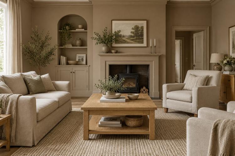
Anyone consulting recent decorating coverage will find greige described as both the sensible successor to grey and as a shade so overexposed it now dates a room. The two claims sit side by side in the same publications, sometimes in the same month, each delivered with complete assurance.
The contradiction is worth unpicking, because the underlying picture is more stable than the headlines imply — and considerably older.
What is not in dispute
The cool, blue-based greys that dominated British interiors through the 2010s are receding. On this there is no serious disagreement. They spread through new-build developments and rental refurbishments until they became the default rather than a choice, and the reaction against them has been building for years.
The commonly cited reason is that cool grey reads as sterile in British light, which is softer and less direct than the conditions the palette was originally photographed in. Whatever the cause, the direction of travel is settled. The argument concerns what replaces it.
Where the disagreement sits
One position holds that warm neutrals are the natural successors: greige, taupe, putty, warm off-white. They offer grey's flexibility as a backdrop while sitting more comfortably with timber, linen and stone, and they photograph less coldly.
The opposing position accepts none of the middle ground. On this account greige achieved such saturation that it has inherited grey's problem — recognisable, ubiquitous, and already reading as a period marker. The proposed replacements are richer and darker: chocolate and mocha browns, clay tones, tobacco shades that read as neutral without reading as beige.
Two observations are worth making about the second argument. It originates largely in American coverage, where the greige wave arrived slightly differently and where paint brands announce annual colours with more commercial fanfare. And it is frequently made by parties with something to sell in the replacement category. That does not make it wrong, but it warrants a degree of scepticism that the coverage rarely applies.
Why both accounts can be true
Two things reconcile them.
The first is chronology. This is not a change announced recently and taking effect now. Farrow & Ball's colour curator was making the case for warmer, earthier tones over what she described as the ubiquitous grey of the preceding decade back in 2021, and the shade Jitney was created specifically to signal that shift — a warm, faintly grey-based brown intended to herald a return to earthier colour. The migration away from cool grey has been running for five years or more. What reads as a sudden reversal is a long process reaching its later stages, with the leading edge already moving past the middle ground while the mainstream is still arriving at it.
The second is definitional. Greige covers a very wide territory. A greige with pronounced brown or mushroom undertones has almost nothing in common with the pale, grey-dominant version that filled new builds, beyond the name. When one commentator declares greige finished and another calls it the shade of the moment, they are frequently describing different colours with the same word.
What the British brands are doing
The domestic paint industry has not resolved the question either, and its behaviour is more informative than its pronouncements.
Dulux broke with its own long-standing convention by naming a family of three blue shades as its colours of the year rather than a single hue — a decision that sidesteps the neutral debate altogether and suggests the brand saw no consensus worth backing.
Farrow & Ball's picks have similarly avoided the territory, spanning soft pink, muted yellow and deep aubergine rather than nominating a neutral at all. Its sales data, however, points somewhere quite specific: Wimborne White has taken the top position in the brand's rankings, displacing All White, its only shade containing no pigment other than white. A warm, complex off-white overtaking a pure one is a small piece of evidence, but it is commercial rather than editorial, and it points the same way as everything else.
The sales picture also supplies a useful corrective to the drama. Whites and off-whites remain the largest sellers by a considerable margin. Whatever is happening at the level of trend coverage, most British walls are still being painted something quiet.
The part that actually decides it
Undertone matters more than category, and it is where most repaints go wrong.
Warm neutrals are built on a base pigment, and that base determines everything. Taupes that pull towards purple, red or yellow tend to cheapen the effect, reading as dated rather than warm. The shades that hold their character are those with a brown backbone, which stay recognisably themselves as the light changes.
Light exposure then modifies whatever was chosen. A north-facing room will render a colour noticeably duller and cooler than a south-facing one, to the extent that the same shade can appear to be two different colours in adjacent rooms. Anything with a grey component amplifies this effect.
The practical response is unglamorous. A sample applied to more than one wall, observed across a fortnight in both daylight and artificial light, will settle the question more reliably than any colour chart or forecast. Applying it over existing paint distorts the reading, so a white primed patch or a board is preferable.
Where this leaves a repaint
Warm-based neutrals are the low-risk choice. They have five years of momentum, they suit the timber, wool and stone that dominate current furnishing, and they are unlikely to look conspicuous for some time.
The browner end is the more current position and the larger commitment. It reads as deliberate in a way greige no longer does, and it holds a room together in low light, but it demands more from the furnishings around it.
Neither is the wrong answer. The determining factors are the undertone, the direction the windows face, and what the floor is made of — none of which appears in a trend forecast.